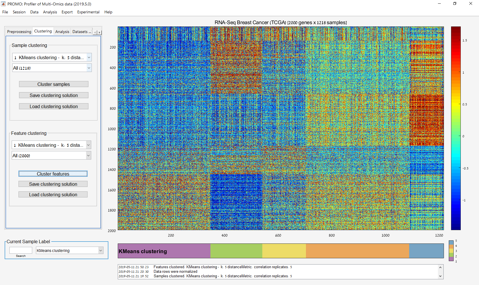
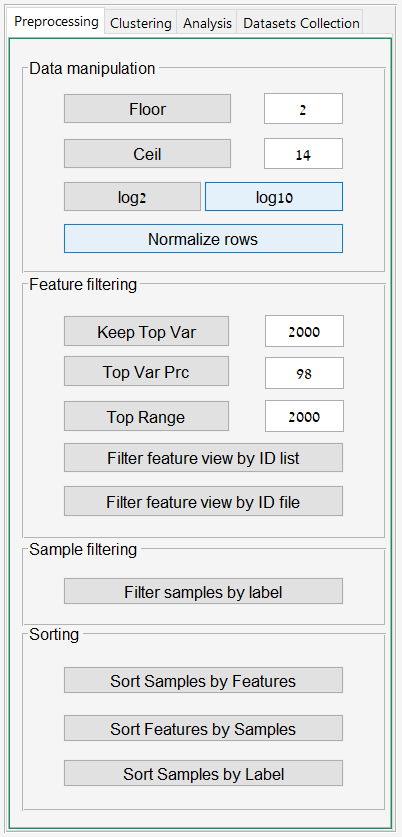
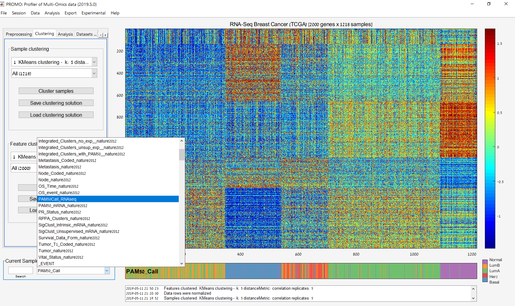
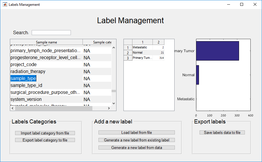
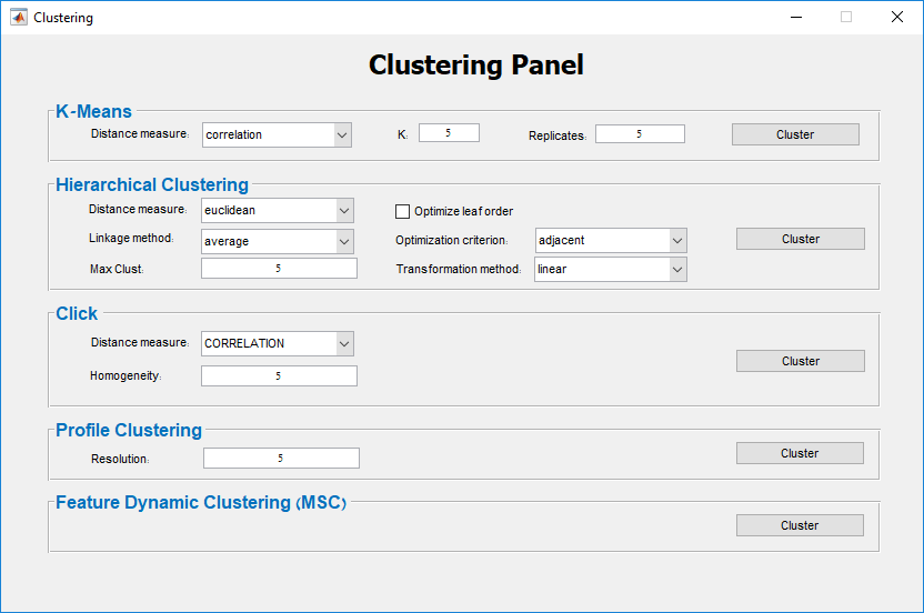
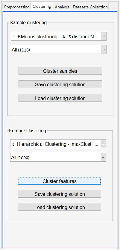
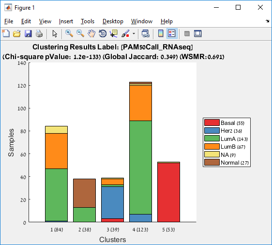
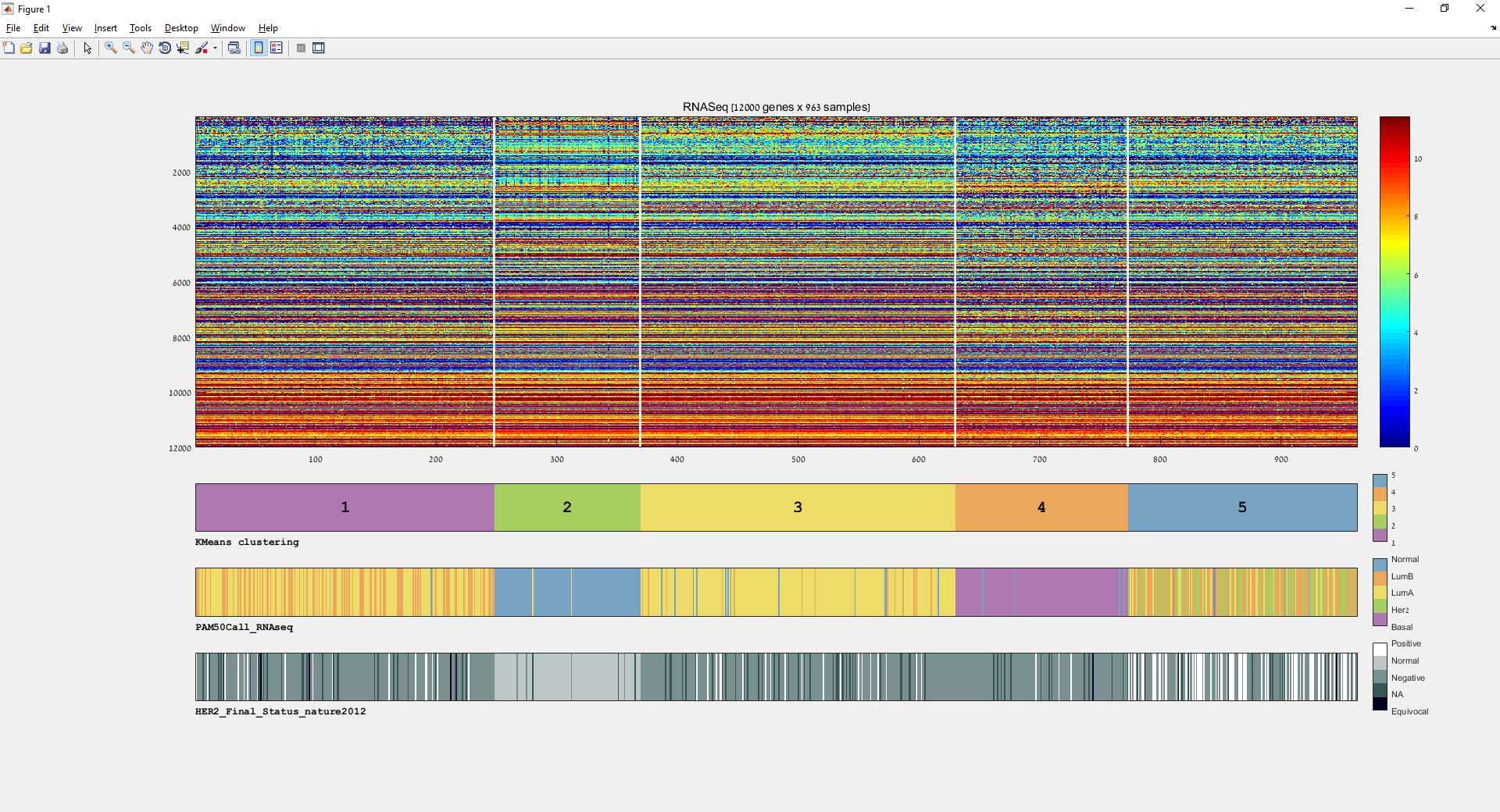
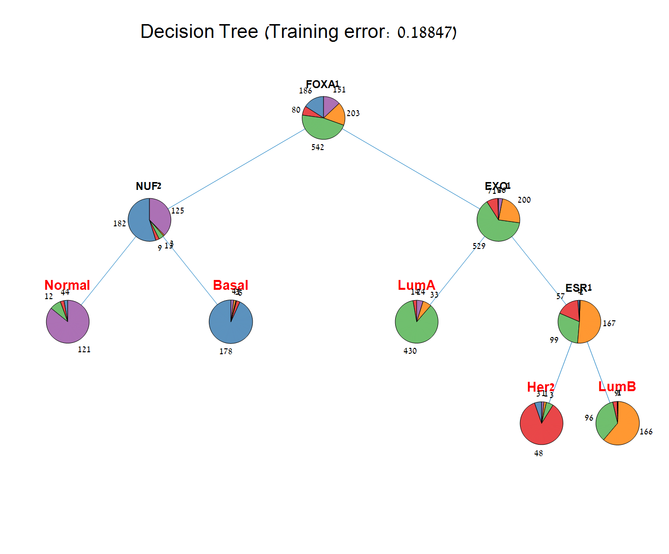
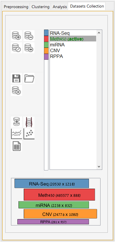
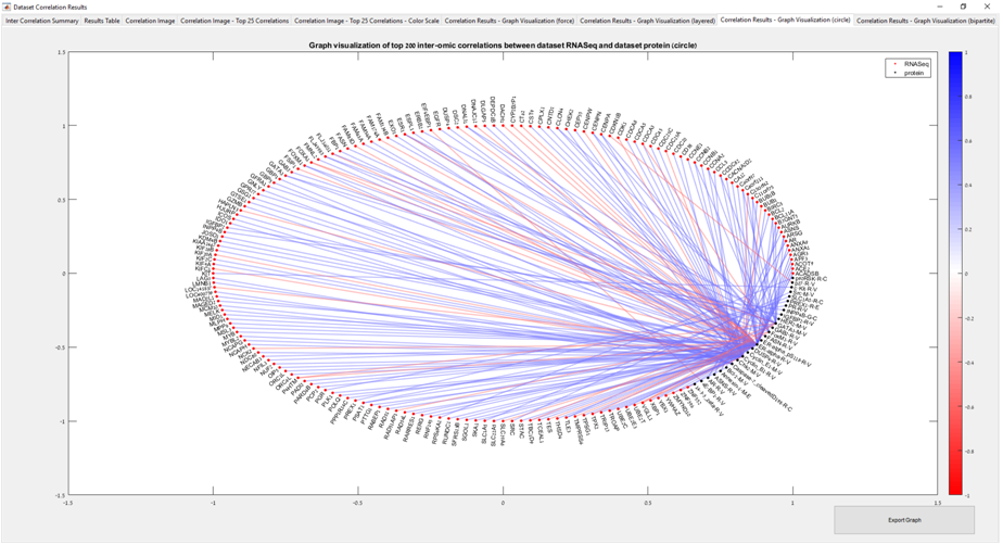
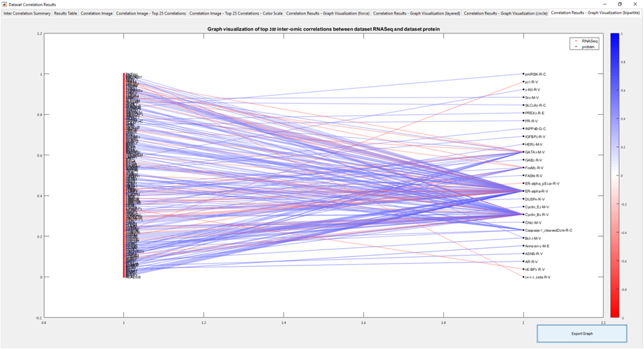
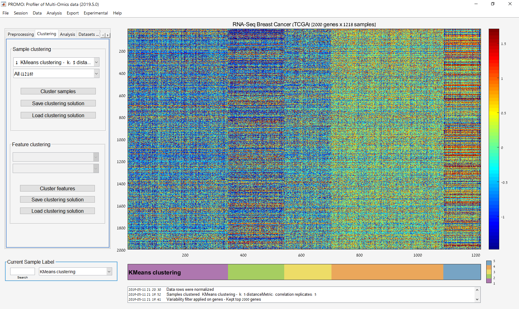
Main screen: An expression matrix whose samples (columns) are clustered using K-Means. The colorbar below the matrix shows the value of a selected label for each sample. Here the clustering label is shown. The log at the bottom of the screen documents the analysis work-flow and includes a description of every operation performed on the dataset.
Main screen: An expression matrix in which both samples and features are clustered. PROMO can apply various clustering algorithms and several distance function on both samples and features. The assignment of samples/features into a cluster can be exported to a file.
The preprocessing tab enables applying common preprocessing steps such as flooring/ceiling values, variance based filtering of the features and feature normalization.
Label visualization on the main screen: PROMO stores a collection of labels characterizing the dataset samples. Selecting a label from the label listbox will visualize it in the label colorbar beneath the expression matrix. Various downstream analysis steps will use label selected here (such as comparing a new clustering solution to a predefined label).
Preprocessing: Filtering out samples based on label values. The values distribution is shown on the right.
Label management panel - From here you can add new sample labels from a file, generate new labels from feature data and transform an existing label to a new one.
PROMO offers several methods to generate a label calculated by gene expression values, using a single feature or several features.
Visualization of data distribution. Top: plot per sample. Bottom: average plot.
Distribution of feature means
2-dimensional PCA of the sample profiles (columns).
3-dimensional PCA of the sample profiles. Image can be rotated.
The t-SNE panel enables plotting 2D and 3D t-SNE plots using selected paramters.
Clustering panel: This panel allows selection of a clustering methods to be applied on either dimension of the active data matrix.
Clustering tab: This tab displays a list of generated clustering solutions for both samples and features. The user can select any cluster for displaying it on the expression matrix. Clustering solutions can also be saved or loaded from the file.
Analysis tab: provides access to commonly used analysis methods such as cluster enrichment analysis, survival analysis, biomarker discovery, building a decision tree classifier and more.
Single label analysis results: Compares two sample partitions (Here produced by a clustering result and a partition based on a selected label. Similarity between the two partitions is evaluated based on Jaccard measure, Chi-Square p-value.
Multi label visualization: Enables choosing the labels to be included as color board below the matrix.
Multi label visualization: The three selected labels are shown in the color bars below the matrix.
Label enrichment analysis results: The matrix shows for each cluster (column) its enrichment for each selected label. Labels are selected in the label management screen.
Multi label analysis results - by clusters
Multi label analysis results - by labels
Survival analysis - Kaplan Meier plots for sample groups that are partitioned based on a selected label. Log-rank p-values are displayed in the legend.
Gene Ontology (GO) enrichment analysis on the feature clusters
The Biomarker discovery panels can be used to apply supervised tests such as t-test, Ranksum test, ANOVA and Kruskal-Wallis on the dataset features in order to find features that are differentially expressed between sample groups defined by a selected label. FDR correction is supported.
Volcano plot - A volcano plot for visualizing the results of supervised analysis aimed at identifying differentially expressed features distinguishing between two sample groups. The plot shows the features using their -log10(pValue) values as a function of their fold-change.
Decision Tree classifier can be generated in PROMO for any selected sample label. Cross-validation is also supported.
Dataset collection tab - here you can load, edit and assemble several different omic matrices into a multi-omic dataset collection, to be analyzed together.
Inter-Omic feature correlation analysis - circular graph: Visualization of the top inter-omic correlations using a circular graph. Blue and Red circles represent top correlated features from omic 1 and omic 2 respectively. Blue edges represent positive inter-omic feature correlation, whereas red edges represent negative correlations.
Inter-Omic feature correlation analysis - bigraph: The same graph is drawn for two types of features as a bipartite graph.
Inter-Omic feature correlation analysis - Clustered distance matrix visualizing similarity between the top inter-omic correlated features.
Integrative Multi-Omic sample clustering using the Multi-Omic Consensus clustering applied on RNA-Seq and Protein datasets.
Visualization of the dimensions of datasets composing a multi-omic dataset collection.